Tax-Efficient Way to Pay Advisory Fees

There are a few rules of thumb that are worth a lot.   A new rule of thumb today is paying investment advisory fees directly out of tax-deferred accounts (IRAs, SEP-IRA, etc.) instead of lumping them together and paying for them from a taxable account.  Prior to the Tax Cuts and Jobs Act (TCJA) of 2017 and the revocation of the deductibility of investment expenses, it was a common practice to sweep tax-deferred account advisory fees from a taxable account to get a tax deduction as a miscellaneous expense.  However, with the tax law change, it is now almost always more economically advantageous to have tax-deferred accounts pay their own investment expenses.

This idea has been written about on many outlets since the TCJA implementation in 2018, but I still run into situations where old habits die hard and I still see the lumping going on.  Michael Kitces, the great thought-leader in the advisory space, has done a good job on this topic and wrote about it on his blog (kitces.com for more detail on this topic).  In summary, the payment of advisory fees from a tax-deferred account still retains an implicit tax deduction since the withdrawal to pay the advisory fees is with pre-tax dollars.

For example, for every $1,000 in advisory fees at the 24% tax bracket, there is an implicit deduction of $240. Or, in other words, you can pay $1,000 in fees with only $760 in after-tax dollars.   Higher tax brackets and inclusion of state taxes makes the benefit even greater.

An offsetting consideration to this situation includes the idea that leaving assets in a tax-deferred account allows the funds to continue to accrue on a tax-deferred basis.  However, despite this being a true statement, the benefits are much less than thought since the tax-deferred earnings are much less than the value of the tax deduction at high marginal tax rates and it takes a very long time horizon to recoup it!  Kitces produced a table in his article that demonstrates this.  

Additionally, for tax-free Roth accounts, it still makes sense to pay those advisory fees from a taxable account since those funds have the best tax treatment and should be allowed to grow tax free as long as possible.

"Alternative Facts" in Mutual Fund Annual Reports

It’s that time of year again when all the mutual fund companies trot out their annual reports with smiling faces to promote their wares.  2018 was a tough year for most fund companies; especially those with active mandates.  According to S&P Versus Active (”SPIVA”) reporting at December 31, 2018 for active large cap mandates, over 5-, 3-, and 1-year horizons 82%, 79% and 64% of active managers underperformed the S&P 500, respectively.  It is interesting to see how this fact is communicated to shareholders.

One fund company that I follow seems to report everything with a smiling face when the underlying facts and figures are to the contrary.  For example, this is from the Executive Chairman’s letter to shareholders, “…believes active risk management offers downside mitigation and may improve investment outcomes” and “long term perspective” is “ensuring our investment decisions align with the investing time horizons of our clients.”  This statement seems to indicate that short term blips in performance are less important than the longer term perspective; so don’t worry about 2018!

When I check the numbers against the text, it doesn’t match up.  As we all know, the S&P 500 was down -4.38% in 2018; the fund I am looking at was down -5.31% so it underperformed.  We would expect the Executive Chairman to say something to mitigate this -0.93% underperformance in 2018.  However, when I look at longer term returns I don’t see much difference.  Over 5- or 10-year horizons shown in the annual report we see continued underperformance to the S&P 500 of -1.28% and -1.10%, respectively.  These figures are just for “A” class shares (60% of the fund), underperformance is worse for the higher cost shares and better for the lower cost institutional shares.

So, it is hard to see how the Executive Chairman can say something like he did, when the numbers don’t match the words.  The “long term perspective” did not help shareholders!  Of note, the $5.1 billion mutual fund saw net outflows in 2018 of -$550 million (about 10% of the fund) so someone is noticing.  All I can say is “Buyer Beware”!

So You Want to be a Millionaire!

Though most advisers accept that a goal-oriented cash flow approach is the best way to determine your readiness for retirement, some people still look for their “number” – a metric made popular by ING commercials back in 2010.  You know, the dollar amount that is saved somewhere that guarantees sunny days and margaritas on the beach during retirement. 

Most of the time, this hypothetical “number” is never adjusted for the dreaded “deferred tax liability.”  Let’s see how this works and can impact your retirement readiness.

Let’s say you have $1,000,000 saved in two equal buckets; one tax-deferred and one taxable, each with $500,000.  Let’s also assume you grew each account by saving $5,000 per year for 25 years and earned a bit over 10% on your investment portfolios.

GrowthOf5k.jpg

The benefits of compound interest are immense (see chart), since each account would have unrealized gains equal to about $375,000 on cumulative deposits of $125,000 to total $500,000.

For the taxable account, if we assume a 15% Federal long-term capital gains rate and a 5% state tax rate, the deferred tax liability is simply $375,000 * (0.15+0.05) = $75,000.  The trouble gets bigger for the tax-deferred account, since the whole account is taxed at your ordinary income rate.  Assuming a 22% tax bracket and a 5% state tax rate the deferred tax liability is $500,000 * (0.22+0.05) = $135,000!

So, you may have $1,000,000, but your total $210,000 deferred tax liability takes a big bite out of the glowing aura! Goal-oriented cash flow investment modeling software does a good job adjusting for this and is a much better way to evaluate your retirement readiness.

How Much Do You Get Paid For Your Risk?

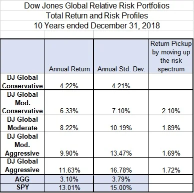
We all know that more risk usually provides more return, but do we all know by how much? There are many different ways to answer this question with multiple factors to consider. A simple way to look at this is to examine the most recent annualized returns and risk (measured as standard deviation) for a consistently managed diversified portfolio index. One such index is the Dow Jones Relative Risk Portfolio index; specifically, the series that includes global asset classes.

The Dow Jones global indices are structured to provide a smooth exposure to risk with a diversified equity, bond and cash allocation. The Conservative index is structured to provide 20% of the risk of a 100% equity portfolio, the Moderately Conservative index is designed to provide 40%, and so on.

DJRiskReturnTable.jpg

As can be seen from the table, one picked up about 2% in annualized return over the past 10 years ended December 31, 2018 from purely picking one risk tolerance compared to its adjacent neighbor.

So, please take your risk tolerance seriously and make sure it fits with your realistic capacity to bear risk. Factors to consider include your overall wealth, income, and lifestyle; as well as your desire to sleep well at night!

How Good is your Asset Location?

Most pre-retirees and retirees have a combination of taxable, tax-deferred, and tax-free accounts. Different asset classes have different characteristics that make them better candidates for each of these types of accounts.

In general, an asset class that generates a high amount of taxable income, like high yield bonds, bank loans, and emerging market debt, are relatively LESS tax efficient in a taxable account compared to a tax-deferred or tax-free account. Alternatively, an asset class that generates a small amount of taxable income, like U.S. growth stocks, emerging market equities, and commodities, are relatively MORE tax efficient in a taxable account. This is because, of course, assets that don’t generate much taxable income and instead generate most of their return from unrealized gains over time don’t pay taxes until desired and at a preferred lower long-term capital gains tax rate if held more than one year.

I am sometimes surprised when I see a tax-deferred account with a large allocation to some clear long term equity winners like Apple or Amazon. Sure, stocks like these have generated outsized gains over time, but the gains will be taxed at usually higher ordinary income rates when withdrawals are made from the tax-deferred accounts instead of at lower long term capital gains rates. Maybe it is counter-intuitive to some, but stocks like these are better off held in a TAXABLE account to make use of the lower long term capital gains rate, or even the cost basis markup upon bequeath after death!

Vanguard and others have done work defining the benefits of investing with a focus on tax-optimized asset location (“Vanguard Advisor’s Alpha”). It depends on a number of variables, but Vanguard has published that it can be worth from 0 - 75 basis points. It is worth understanding the pros and cons of tax asset location, and then customizing a mix that suits the needs of the investor.

Dividends and Treasury Yields

Dividend-paying stocks have been a great place to be for the past 10 years or so. After the Great Recession in 2008-09, investors looking for yield were forced to look elsewhere from treasury bonds. Treasury bond yields were around the mid-3’s in 2009-10, but quickly fell to the 2% range in 2011 once the Fed’s aggressive quantitative easing (QE) steps took hold as a more proactive force to prop up the weak economy.

DVYAnalysisChart.jpg

The benefit of dividend-paying stocks at that time was clear: earn more than treasury bonds AND have the potential for price appreciation, something that bonds were unlikely to provide given the historic low level in yields. This hand played out very well over the past 10 years as dividend paying stocks, represented by the iShares Select Dividend (DVY) ETF, continuously out-yielded 10-year treasuries AND provided some great price appreciation (see the attached chart for detail). Yes, much more risk trading bonds for equities, but if the need for yield is what drove the investment decision and there was less of a focus or need for price stability, then the investor was aptly compensated.

The question now is, “will this continue?” Can the past 10-years of a “once-in-a-lifetime” scenario continue? Certainly, DVY still has a yield advantage over 10-year treasuries and we are observing a “dovish” Fed currently, so in the near term, “sure”. In fact, tough to see this situation unwind, since if the yield relationship reverses, then there could be a flurry of demand for Treasuries, thus pushing their yields down. We shall see.

Smaller Tax Refund? Big Deal!

The mainstream media is abuzz about the smaller tax refunds being sent out by the IRS this tax season. The New York Times says, “Smaller tax refunds surprise those expecting more relief”, CBS News says, “Americans shocked by impact of new tax law”, while Fox News says, “Smaller tax refunds are a good thing”. Each media outlet has their own spin depending on their agenda, but the real issue is the lack of financial literacy and planning to avoid surprises that could have easily been avoided.

The new tax laws effective for 2018 were well communicated if anyone took the time and energy to understand them; certainly the tax and planning industry was well-versed in the impacts. The elimination of tax deductions due to the $10k limit on state and local taxes (SALT) and the limit on the interest deduction on high value mortgages became a new tax burden for residents in high tax and high property value states. The almost doubling of the standard deduction was intended to lessen that burden, but some high income earners with large SALT and mortgage interest were sure to see an increase. So, taking the lowered payroll withholdings due to the lowered tax brackets was a flawed assumption if you ignored the loss of those large deductions in your tax planning.

Alternatively, if you were NOT a high income earner, your total Fed taxes likely went DOWN, but you simply got a smaller tax refund because you took a portion of your end-of-year refund in smaller bits during the year due to the lower withholding amounts. Effective planning could have easily avoided this “surprise”. Moreover, consistent with the Fox News article, a Treasury spokesperson said in a statement, “Smaller refunds mean that people are withholding appropriately based on their tax liability, which is positive news for taxpayers.” Unfortunately, this seems to have happened to some taxpayers due to inaction and ignorance instead of through conscious planning.

Keeping more of your money during the year with an effective saving and investing strategy makes much more sense than giving the government an interest-free loan during the year. Hopefully, this kind of event will cause a more focused interest in financial education and planning.

"V" gets a Vote of Confidence!

SPY2018-12to2019-02-15.jpg

“Buy the Dip” appears to be alive and well! After the abysmal October leading into the horrid December, things have recovered quite nicely! From the recent plateau on December 3, 2018, the S&P 500 (per the ETF, SPY) is only 0.77% off that level per the above chart. Not a pure “V”, but pretty close!

Though the mainstream media does a good job pitching its dire Koolaid to drive ratings and eyeballs, the doomsayers have not been too accurate thus far. On these pages, I have commented on weaknesses in the predictive ability of a yield curve inversion to forecast a recession, identified underlying strength through the important PMI (Purchasing Mangers Index) levels, talked about positive technical factors such as seasonal rebalancing into equities after the large Q4 and December drawdowns to get back to equity targets, and highlighted some well-thought out (and positively-leaning) forecasts from Northern Trust Asset Management and my prior firm, Sun Life Financial.

It is a very rare situation, indeed, where it would be prudent to rebalance away from a strategic allocation to “risk” assets. The situation through December indicated a reasonable case to be cautious, but not fearful, while waiting for some key economic statistics to show their hand. Happily, hanging onto your hat and weathering the storm appears to have paid off this time - for now.

Tactical Manager Update: GMOM

Last month I reported that Cambria Investment Management, a popular tactical investment strategist, put out an update titled “Red Light” indicating their cautious market stance. They put their money where their mouth was and positioned their tactical ETF, ticker: GMOM, into mostly bonds and precious metals. So, how have they done so far this year?

Based on results from Morningstar year-to-date through yesterday, Feb 7, they are up +1.89% compared to the S&P 500 of +8.09% and the Morningstar Moderate Target Risk of +5.48% and the World Allocation of +5.40%.

Since this is an ETF, we can track their actual holdings every day. As of yesterday, they have kept a 7% allocation to precious metals, but shifted to a 30% equity weighting mostly in emerging markets, global utilities/healthcare and real estate. So, still cautious, but holding some risk assets in a barbell manner with both risky and traditionally defensive sectors.

PMI Jumped in January!

It is hard to overlook a dramatic increase in one of our most important economic statistics, the ISM Purchasing Managers Index (PMI). Observers were warning to be cautious when the December value came in at a weaker growth level of 54.3, down from the 58.5 level of November. Values over 50 indicate growth and under 50 indicate contraction. So, it was surprising when January came in at a level of 56.6, improving to close in on the November level! The current level of 56.6 is still below its 12-month average of 58.5, but the upward trend is a positive result.

Most interestingly, this growth in the PMI can be correlated to a 4% real GDP growth, so underlying strength in the economy seems robust if it can be maintained. Some observers are calling this the “Goldilocks” economy, harkening back to a time when stable interest rates, low inflation, strong job growth, strong dollar, and strong earning growth all coexist without any observed stresses. We shall see.

How Good was January?

The mainstream press is agog over the capital market performance in January 2019. “The best January since 1987”, “Best Month in three years”, and “Best Monthly Performance in Decades” are plastered all over as headlines. Yes, the markets had a great month with all major indexes making big moves upward, but lets take the performance within the proper context.

As we all know, December was very weak! Though there were many factors flashing a warning sign, but nothing in the tactical tool box indicated despair and anything resembling a prolonged massive selloff. I believe it was fair to be cautious, but no reason to be risk off. So, it is quite logical to recover from an “oversold” position with a strong move in the opposite direction. Also, I have been a fan of supply and demand aspects occurring in January where most institutions and client accounts get rebalanced to their long term strategic targets; and given the October and December equity drawdowns, it certainly made sense that equities would see a “buy” sign to get back on side.

The Dow Jones Aggressive U.S. Portfolio Index, a 100% equity index including large, medium, and small cap stocks was up +10.20% in January recovering from a -9.97% December; not quite a full recovery, but close. We will see if the market has enough confidence in the new dovish Fed stance and potential for easing of China trade tensions to recover from the October drawdown to approach new highs.

Bond Ladder? Yes or No? When?

There has been a lot written about bond ladders over the recent past. Unfortunately, lots of what has been written is misinformation.

The idea of a bond ladder is to buy bonds with different maturity dates in sequence; i.e., 1-year, 2-year, 3-year, etc. so that they mature at scheduled dates at their full par value. You get all the interest and the full principal back at par value. The thought is that in this way you will never lose money in bonds if rate rise (since that is when bonds decline in value).

The problem arises when you compare a bond ladder to a traditional bond fund or ETF. The comparison usually starts with the naïve view that the bond ladder didn't lose money and outperformed the bond fund/ETF over a certain rising rate environment. However, that comparison only makes sense if the maturing pieces of the bond ladder were taken out of the ladder and spent on something like an expense. In essence, you were shortening the duration of your bond investment and of course that would outperform a bond fund with a longer duration. If the bond ladder were instead reinvested in a manner similar to an equivalent bond fund at inception maintaining its target duration, the results would be exactly the same.

The only times that a bond ladder makes sense is when the interest cash flows and maturing pieces are to be used to fund some liability or expense, immunizing the liability or expense cash flows. In that case a bond fund/ETF would be inferior since you would be taking on interest rate risk when you instead needed to shorten the duration of your assets to match the duration of your liabilities/expenses.

If you could "market time"...

Morningstar Advisor magazine, a publication from Morningstar tailored to the advisor population, consistently produces high quality commentary and analysis on investment topics. One of my favorite articles was published way back in 2013 relating to market timing; I.e., the ability to be in the right asset class at the right time to pick off every inflection point in market volatility.

In the article titled, “The Existence of Market-Timing ‘Intelligence’”, they quoted a study showing what could be gained if an investor had perfect foresight. In other words, what is the best someone could do if they called every market rally and dip. The article states that from 1926 to 2011, if an investor correctly chose the right bond or stock mix each month the total return would have been 31.9% annualized; a value much higher than the long term stock-only portfolio of about 10%.

The difficulty remains, however, to be able to find the manager “ahead of time” who has the ability (or luck) to be successful in this endeavor.

Tactical Managers Trending to Defensive Bias

I make it a point to follow all competing views in the tactical manager space to gather a balance insight and view on the capital markets. I don't take scientific polls, but I certainly have seen a shift to “defensive” positioning in that space.

One popular tactical manager, Cambria Investment Management, sent a note around yesterday titled, “Red Light?” They make the point that they don't know if the market is going up or down, but their signals are indicating a defensive posture. They have put their money where their mouth is, too. The current positioning of their tactical ETF (GMOM) is invested almost entirely in bond funds and precious metals, as opposed to equities (http://www.cambriafunds.com/gmom-holdings). YTD their total return of +0.58% compared to the Morningstar Moderate Target Risk of +2.29% and the S&P 500 of +3.10%. Yesterday, when the S&P 500 was down -0.51%, the GMOM ETF was up +0.02%. Curious to see how this works out? I will check back and post an update in a month! Follow me to see.

Single-Stock and Single-Sector Risk

A couple of weeks ago, I wrote about how the S&P 500 index is the “sum of its parts” and made up of different industry sectors. I specifically referenced the Utilities sector as a traditionally “defensive” sector that is used by one tactical manager to give signals for strength or weakness in the markets.

Well, news today makes it hard to call the Utilities sector “defensive”! Pacific Gas & Electric (PCG) today indicated that it plans to file for bankruptcy due to potential liability for the fires in California. No telling where this may end for PCG at this early stage, but this simply highlights the trouble with single-stock and single-sector risk. PCG stock was down -50% during today and the Utilities sector ETF (XLU) was down -2.2%. Though this did not come out of nowhere, it is a shock to the system and a more broadly diversified portfolio would help insulate against this occurrence materially impacting your portfolio performance.

Lies, Darn Lies, and Statistics!

You have all probably heard this title’s saying before; statistics can be misleading if not thought through carefully.

While updating some client materials, I noticed an interesting anomaly relating to S&P 500 returns. The phenomenon of “time period bias” has reared its ugly head!

For the 10 years ended December 2018, the S&P looks like a great winner with 13.01% average annual returns (even including the large drawdown in Q4); much higher than its longer term historical trend of about 10%. This compares to the 10-year period ended in 2017 that showed only 8.45% average annual returns. This large discrepancy in returns is due to the difference in the starting points surrounding the Credit Crisis in 2008-09. The 10-year returns for 2018 starts with a much lower base (December 2008) compared to the starting point for the 10 years ended 2017 (December 2007).

This might qualify more as trivia instead of significant investment info; but, it is important to be aware that the 10-years ended 2018 is an anomaly that significantly deviates from longer term historical returns. For anyone running investment projections, it is best to either use more realistic projections or a longer time horizon.

Market Outlook from Northern Trust Asset Mgmt

This is the time of year when all the investment houses promote their market outlooks for the coming year. I don’t usually listen for whether the market is going to be up or down, but what underlying factors could cause concern or opportunity.

I listened to a webinar from Northern Trust Asset Management today. They are taking a “neutral” risk stance since they would rather protect the downside instead of missing a large upside. Their key rationales for this positioning focus on the uncertainty of increased Fed tightening and potential for disruptions in global trade due to U.S./China trade negotiations.

For their “target” long term strategic portfolio, they have minor tweaks in risk and risk-control assets: they underweight cash, TIPS, and EM equity and overweight high yield and U.S. investment grade debt. They are “at target” for U.S. and Developed ex-U.S. equities.

Happy to send along the pitch book for this webinar if interested; just let me know

It's Not Easy Being Green!

The difficulty of active managers to outperform passive investments has been well-documented over the past several years. Those studies usually look at stock-pickers and not so much at tactical asset allocators. But now, looking at last year’s data from Morningstar, we can see how difficult it is for that class of investment manager.

According to Morningstar, out of the 269 Tactical Allocation funds in that Category, ONLY 2 funds had positive returns in 2018 (were green!). Of course, the S&P 500 was down -4.5% total return in 2018, so being negative isn't necessarily a bad thing. Even then, I only counted 19 funds that beat the S&P!

Tactical allocation managers usually use a combination of short term technical and fundamental methods to guide their fund positioning, such as quant methods, momentum, rich/cheap relative value, etc. This is in contrast to long-term strategic managers that takes into account longer term asset class relationships. But, long term buy-and-hold had a tough year in 2018, too; the iShares Moderate Allocation ETF (AOM) was down -4.0% in 2018. The active versus passive debate continues!

See this link for a complete list of all the funds in that Category: news.morningstar.com/fund-category-returns/tactical-allocation/$FOCA$TV.aspx